COLORS and STYLES

Written by Alfred
Last updated
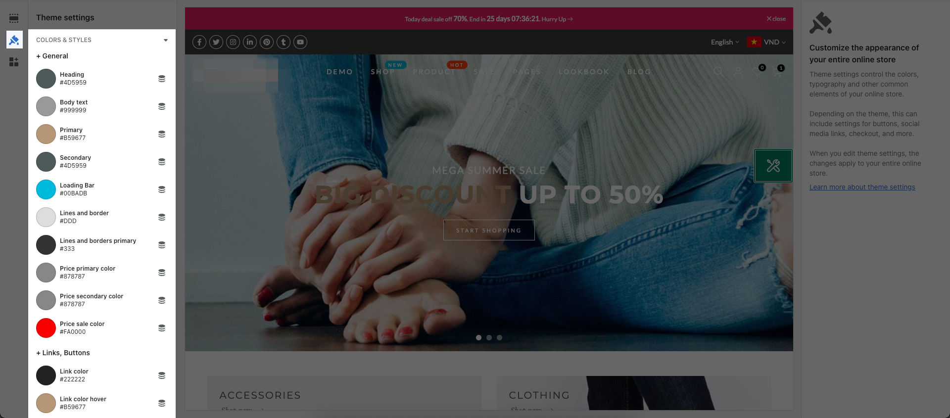
From Theme settings -> COLORS & STYLES

Notice: In this Setting, you will see Connect dynamic source options next to them. That is Shopify's feature so We are not involved and will not support any issue related to them.
1. General
You are allowed to change the colors of any sections on your store.
Heading: You can change Heading of some sections like: Product form, Filter, Sidebar collection, Layout switch, ...
Body text: You can change the text color of your store.
Primary: You can change the color when hover to Blog tilte, Add to cart button, Filter, Sortby,...
Secondary: You can change color of Sub title, border Quantity, Wishlist, Compare, Product meta, ...
Loading Bar: You can change color of the Loading bar on the top when your page is loading.
Lines and border: You can change color of the Line on the top and Swatch border at Collection page.
Lines and borders primary: You can change color of Swatch border at Collection page when you hover.
Price primary color: You can change color of Product price in Frequently Bought Together feature or Size chart, Delivery, Ask
Price secondary color: You can change color of Product Compare at price in Frequently Bought Together feature or Size chart, Delivery, Ask
Let see an example:
2. Links, Buttons
You are allowed to change the color of Links and Buttons on your store.
Link color: You can change color of the Links on your store.
Link color hover: You can change color when hover to the Links on your store.
Button background: This option allow you to change the Background color for Button in HTML code that you add to your store.
Button color: This option allow you to change the text color for Button in HTML code that you add to your store.
Let see an example:
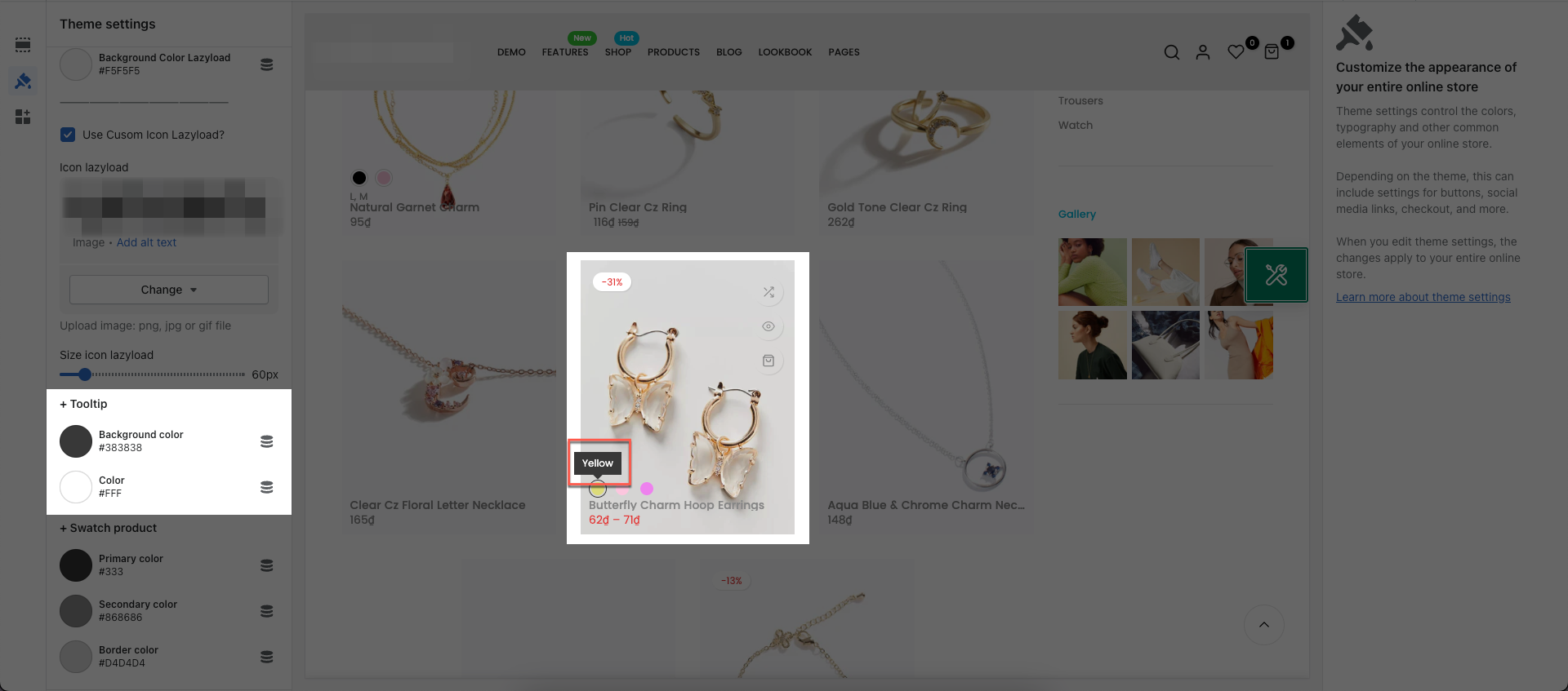
3. Lazyload Icon
You are allowed to change the color and Cusom Icon Lazyload.
Let see an example:
4. Tooltip
You can change color for background and text.

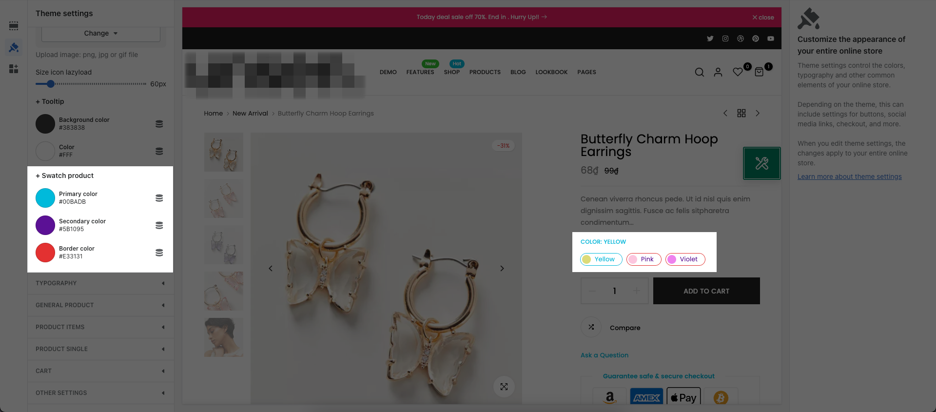
5. Swatch product
You are allowed to change the color of Swatch product.

6. Styles
Primary corner radius: Except for button which have their own options.

Secondary corner radius: Use for small button eg: Remove item on cart, button close, button tools on cart.

Other corner radius: This option will help you to set border-radius for specific elements text input box, selection box, text area... Except for elements which have their own options.

[Private Offer] EComposer Partner Plan
Exclusively for Belyn users, you can get EComposer - Theme Partner Plan for ZERO and start making beautiful, high-converting store pages today:
FREE 100% EComposer Standard plan for 6 months (save you $114)
Build ANY Shopify pages: Landing page, Sales Funnel page, Lead pages, & other custom pages tailored for your marketing campaigns.
Create advanced sections & add to Belyn with ease
Save up to 50 pages/sections
100+ professional, stunning pre-designed templates
Anyone can build pages with live drag-drop editor
How to claim offer: Install EComposer HERE. Then open chatbox icon in EComposer dashboard and leave a message with subject “Belyn+EComposer” to upgrade for free
Cheers,
The4.
